
________
Since this organization exists to support education and interpretation around everything regarding Carlyle Lake, the logo creation naturally grew from the landscape itself.
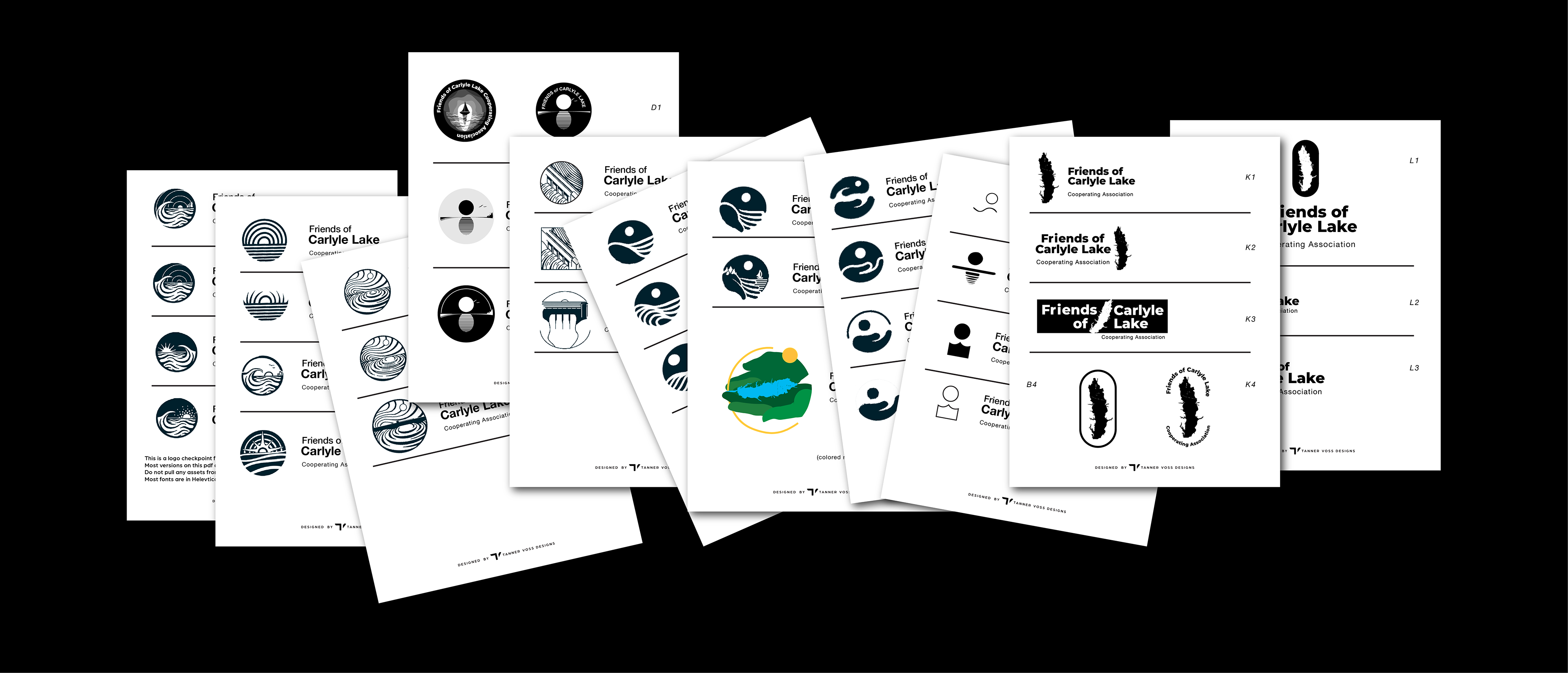
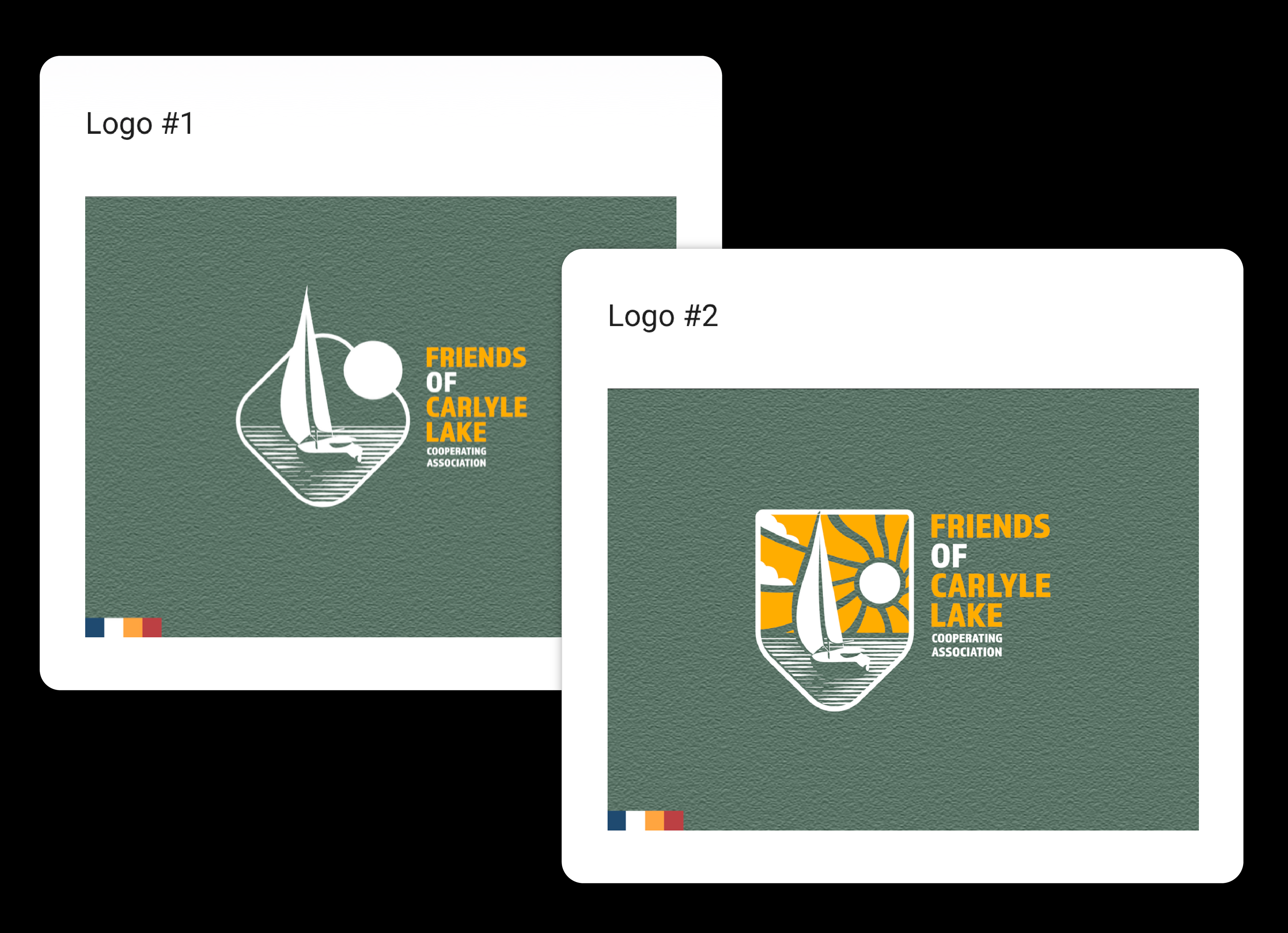
Over 40+ style directions were explored and voted on by their team members. 40 was narrowed down to 2. And then, only 1.
________
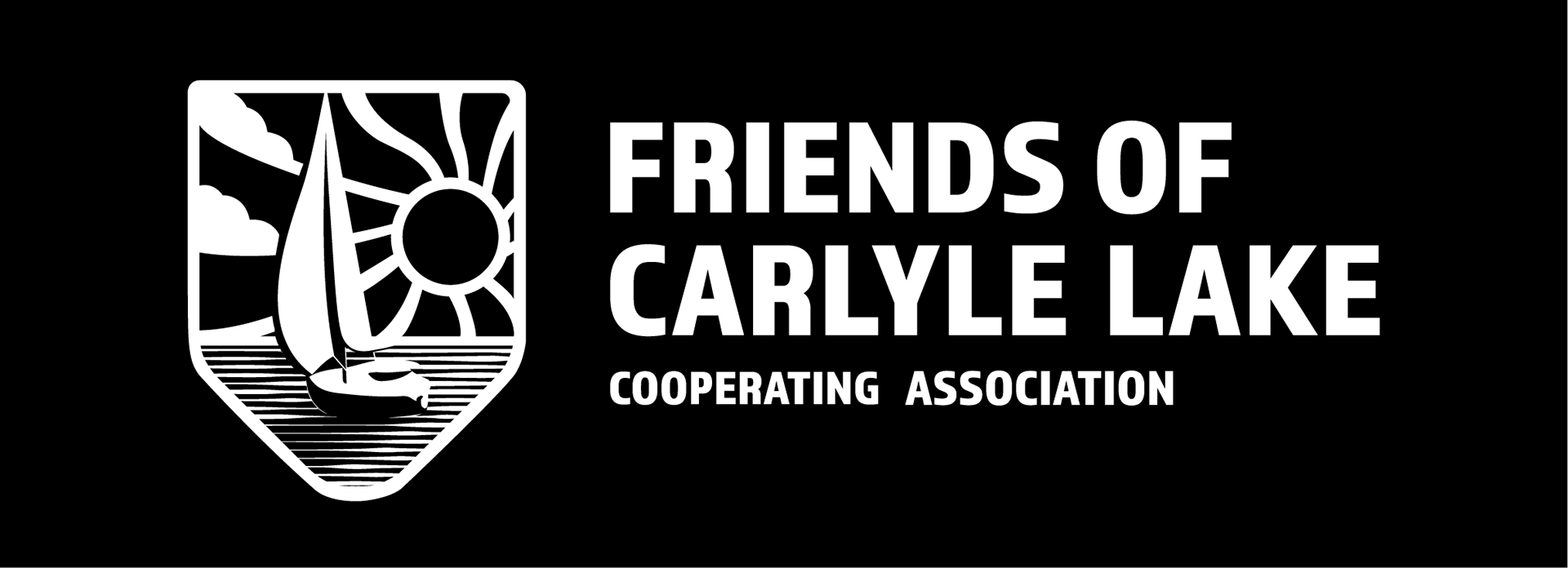
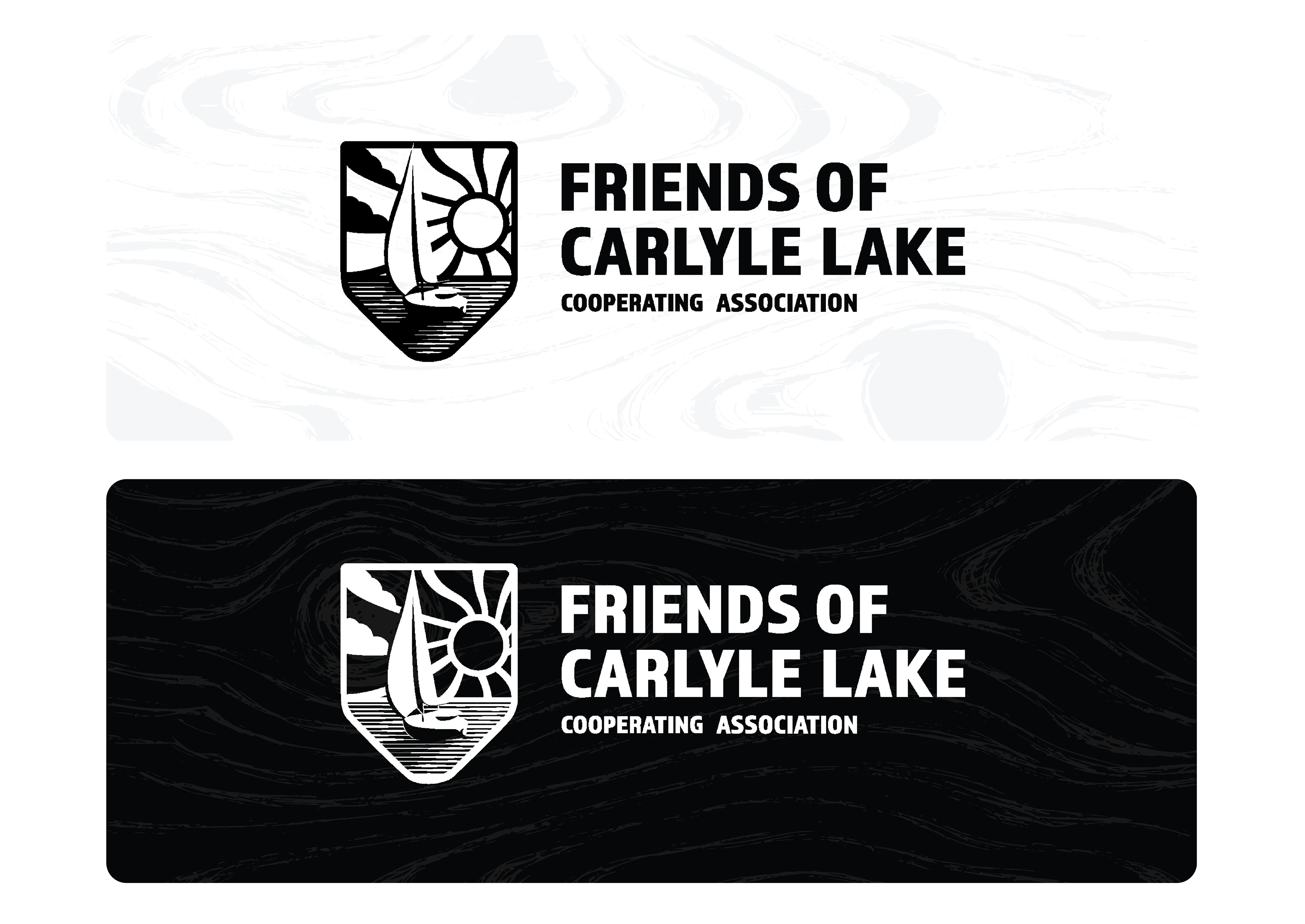
The final mark shows a sailboat at half-mast resting on the calm waters of Carlyle Lake—a quiet symbol of exploration, reflection, and the calm experience people may have when they visit the lake.
________
This logo creation project focused on handcrafting a unique and captivating logo mark to help their team present a consistent, welcoming presence across print and digital touch-points during their startup process.
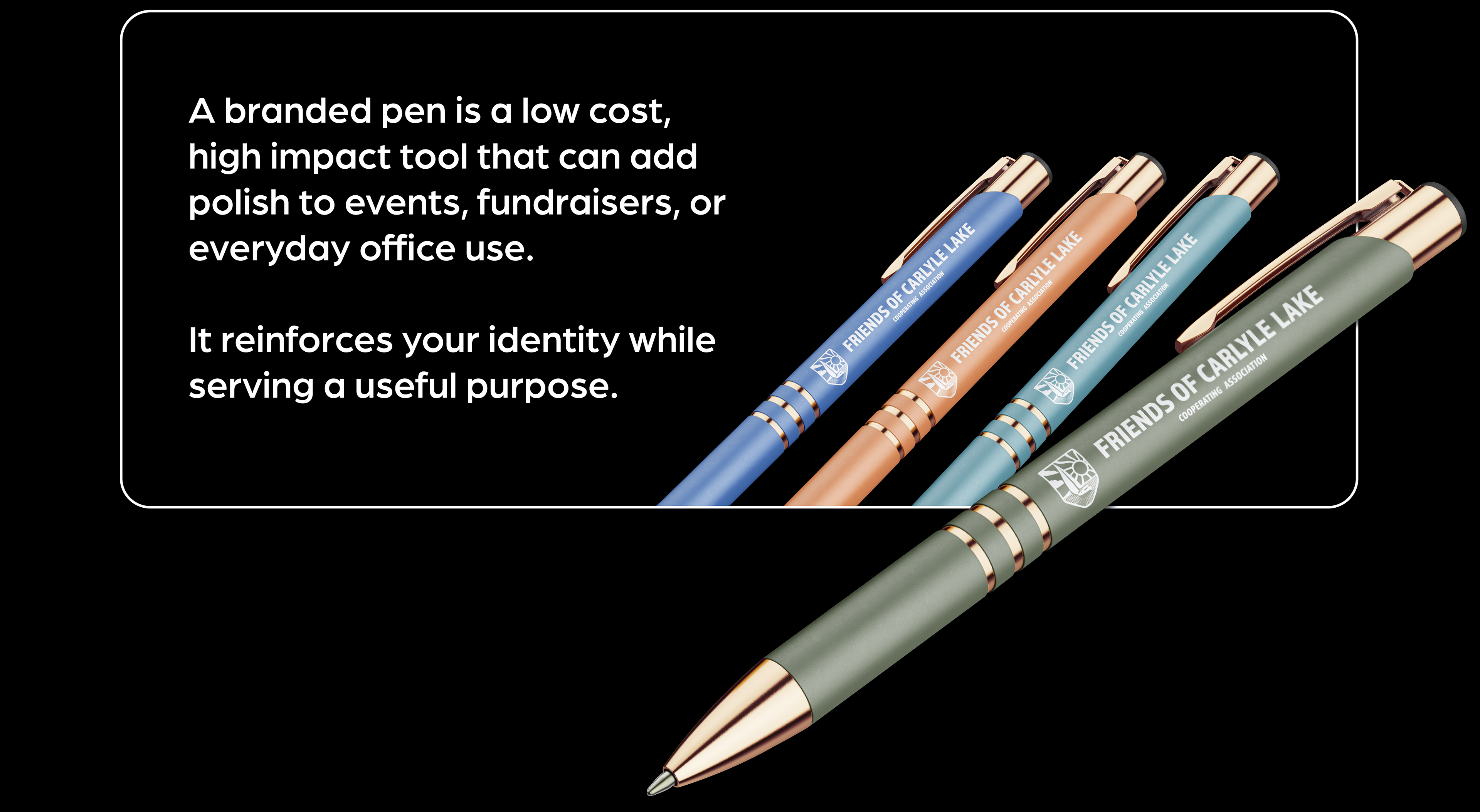
Like many nonprofit efforts, this organization is still growing. Only now, they have the ability to start branding their mission and efforts with a professional visual identity mark that can travel anywhere with them—from educational materials and events to partnerships and community outreach.
________
To ensure proper contrasted options were available for visual brand usability, an inverted logo option was also created. Minor changes were made to allow both logo options to appear equally legible and recognizable while maintaining the integrity of the structure and design.
________
As this organization gains momentum, we hope to expand on this project to establish a working color palette as well as other branding tools for their team to utilize.
Click the link below to see custom illustrated materials used towards their first annual 5k event.